USABILITY TESTING · WEBSITE REDESIGN
Usability and redesign for a Kenyan tourism platform
Naks Yetu wanted visitors to discover Nakuru. We watched seven people try to do that on their website and fixed the major problems.
THE PROBLEM
Would you plan a trip to a place you couldn't get a feel for?
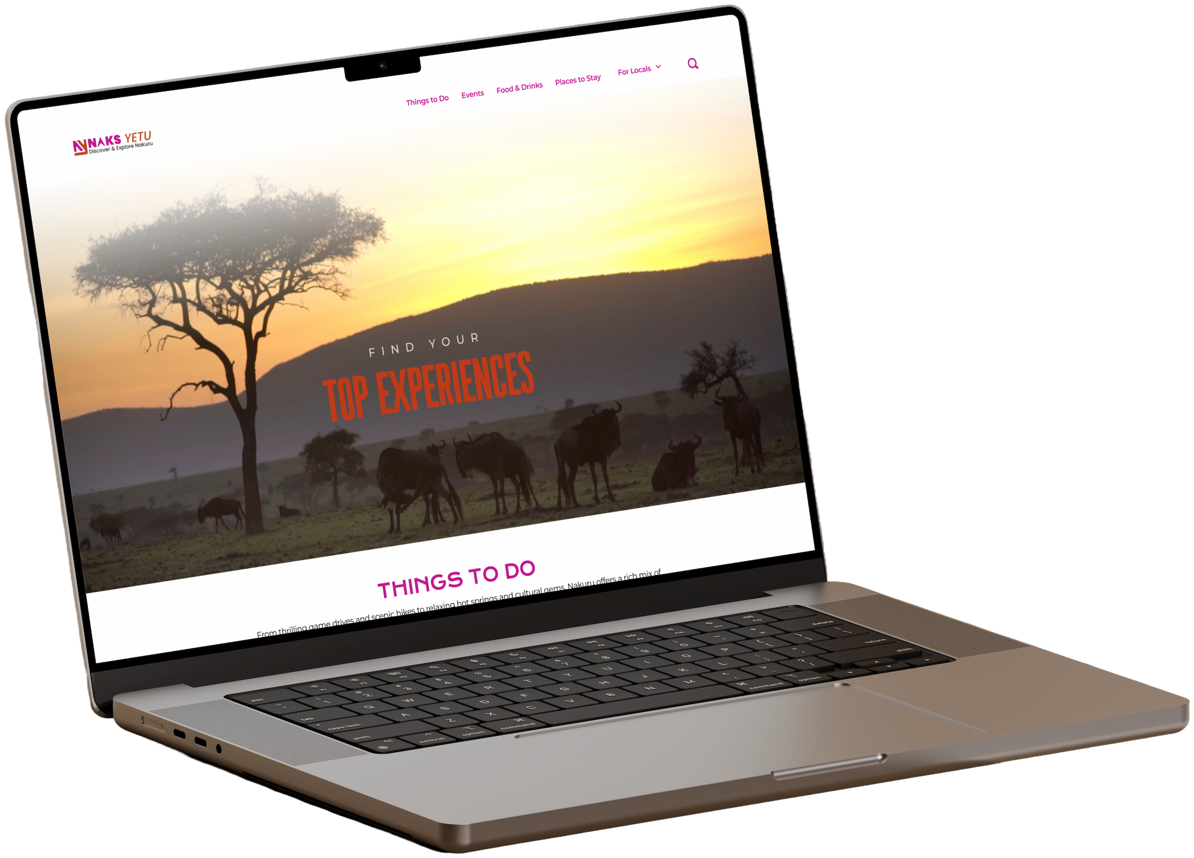
Naks Yetu is meant to be the one place to plan a trip to Nakuru County, Kenya. We ran moderated usability testing with seven people looking for their next trip, and they scored it 57%.
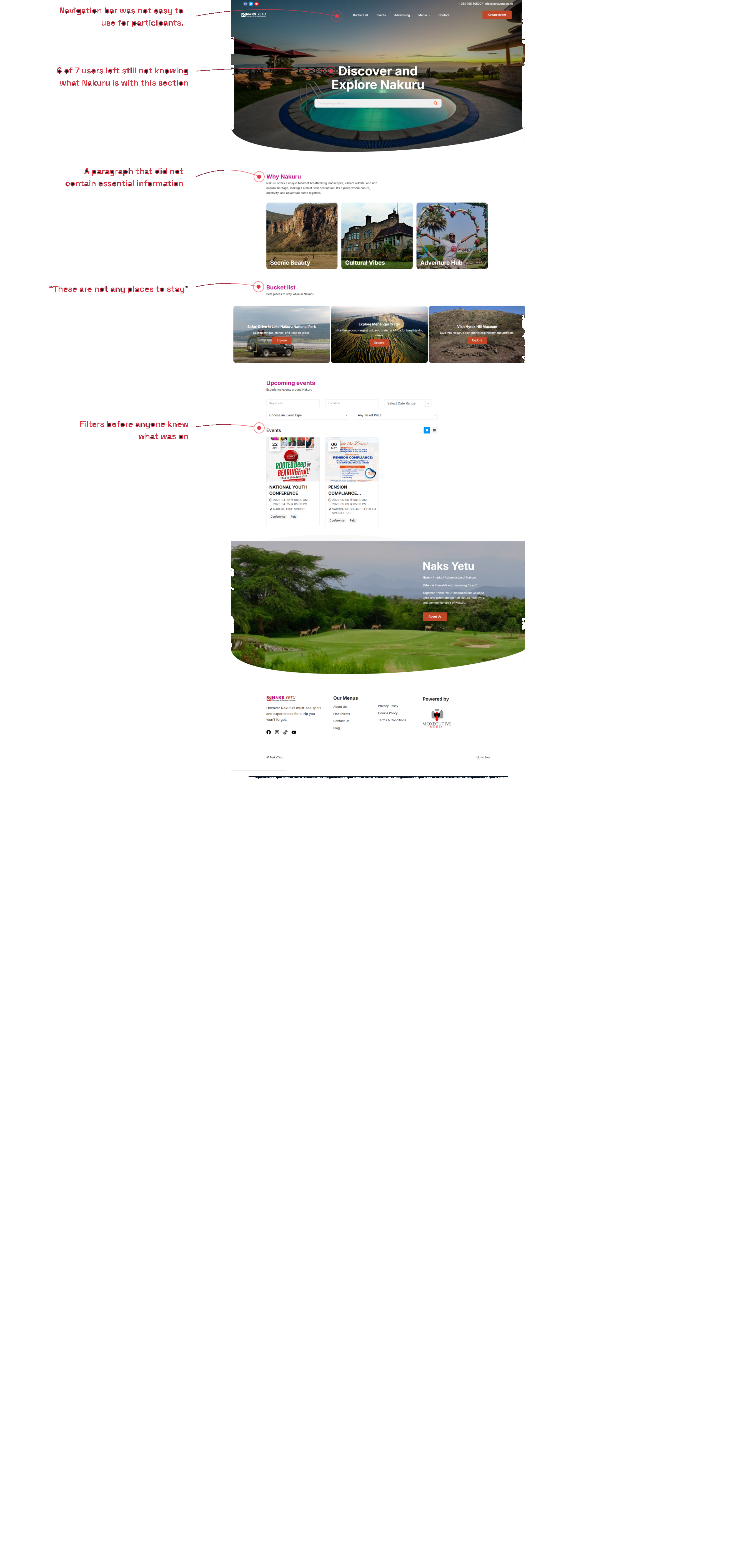
All participants got stuck registering for an event, 86% could not tell what the site was for, and the activity pages had no prices, no times, and no way to act.
“This is exactly what I wanted… I just didn’t know where it was.”
“It says bucket list, events… is this a travel agency or just a place to get ideas?”
“I think this is some sort of a resort… or travel agency.”
“So I just email and hope it works?”
“I was expecting something like Eventbrite… but here I have to email someone.”
“How to book it? I’m not able to find that out.”
AN OPPORTUNITY IN WHAT WAS ALREADY THERE
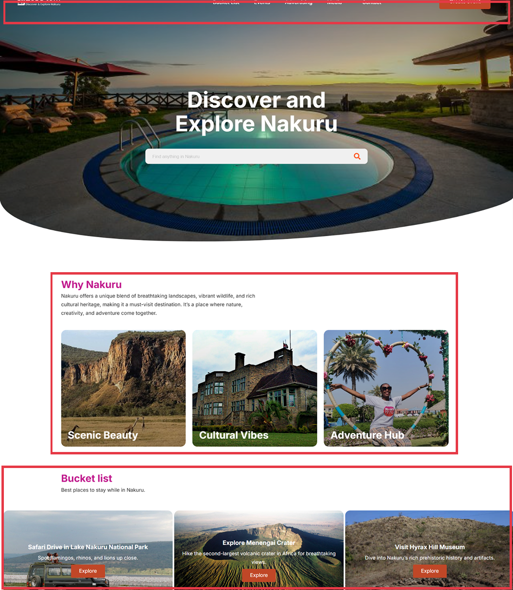
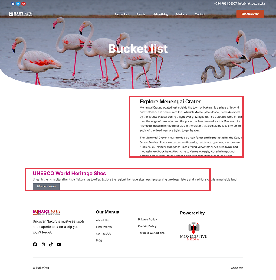
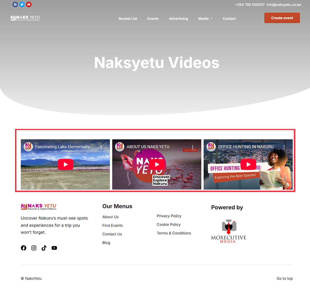
Every page stopped one step short.
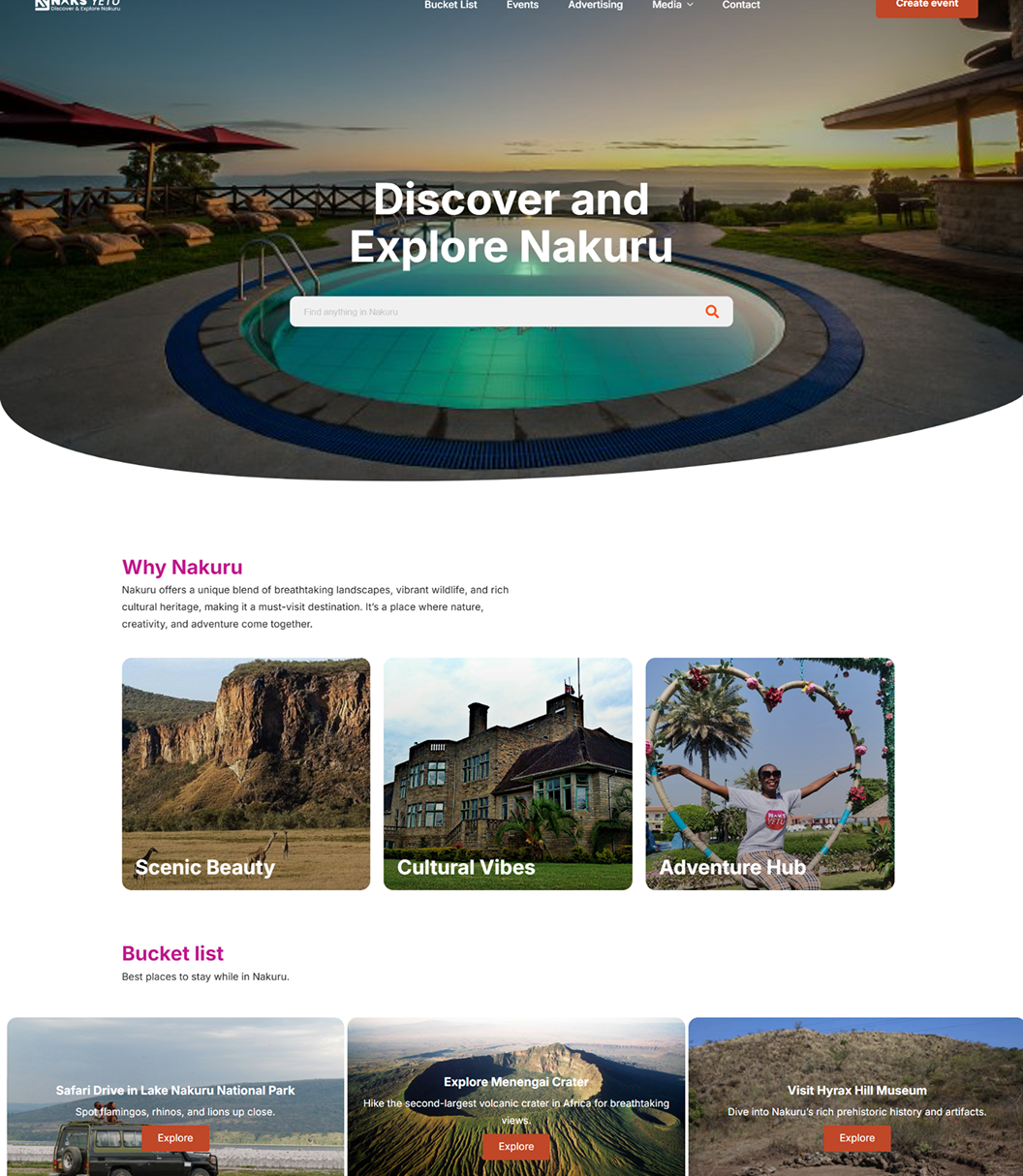
The bones of the platform were there, with pages for activities, events, and submissions, but each one stopped just before the piece a visitor needed, whether that was a price, a duration, or a way to register. The opportunity was to finish what was already built rather than start over.
THE SOLUTION
Naks Yetu redesign
We redesigned five pages around what testing showed was missing.
This is what it looked like:
(Yes, there are some placeholder videos in the hero sections for Naks Yetu to update themselves.)
HOW WE GOT IT DONE
The issues found and the recommendations to fix them
Drag the slider on each one to see what changed and why. These are proposals, built to give the team a direction they could act on rather than a list of fixes.
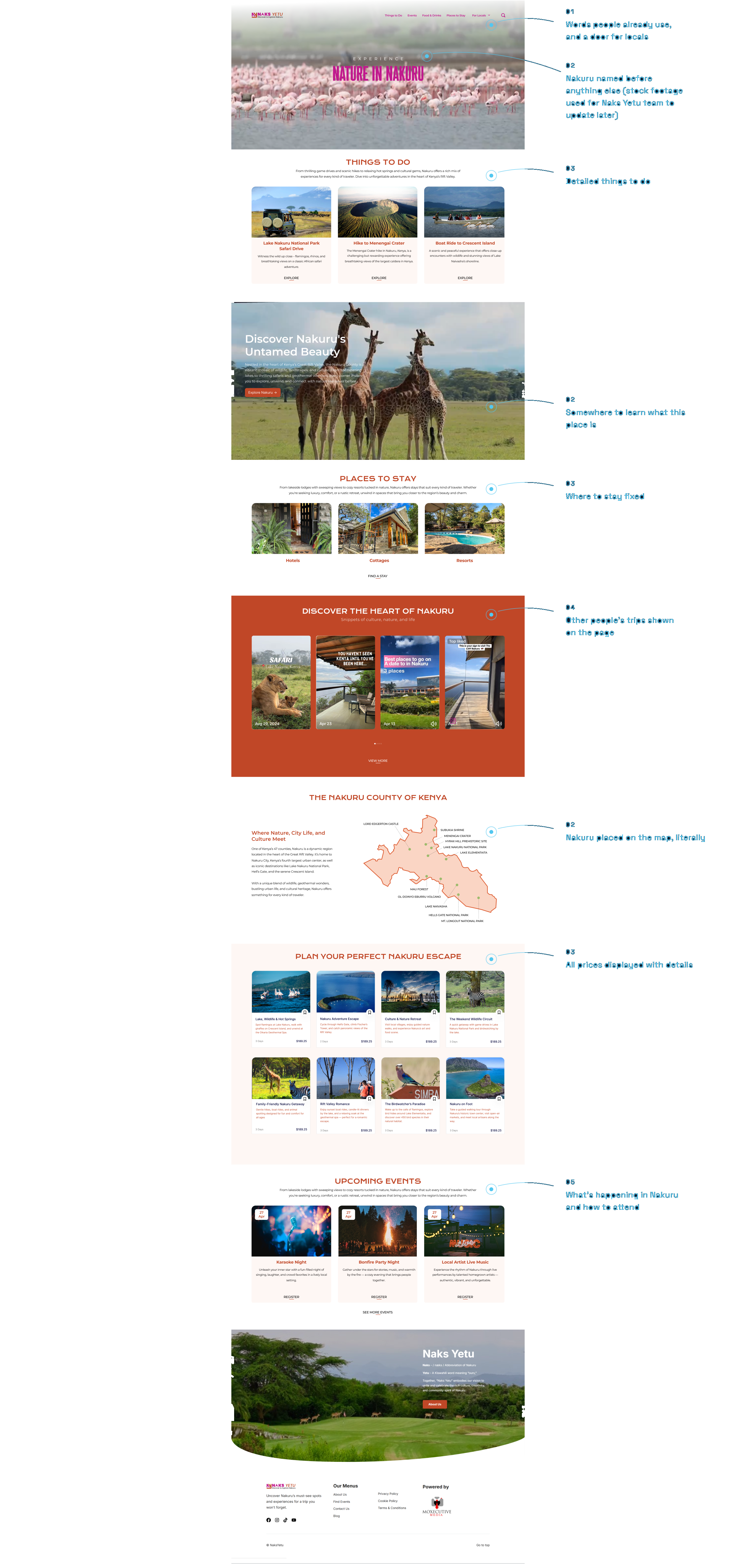
Issue: 86% couldn't say what the site was for, or what Nakuru even is.
Recommendation: Lead with Nakuru itself and put real visitor content on the page.
 ‹ Drag ›
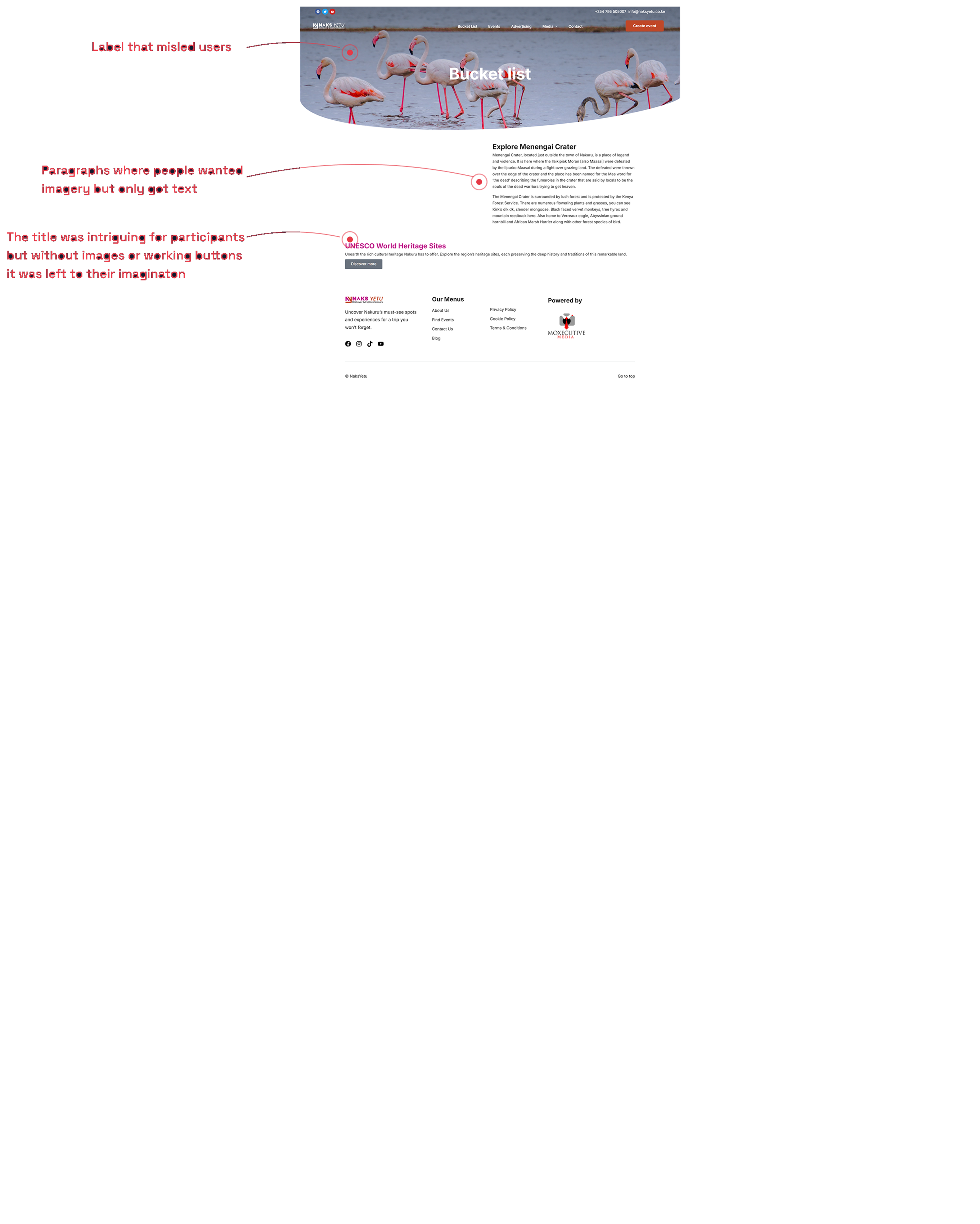
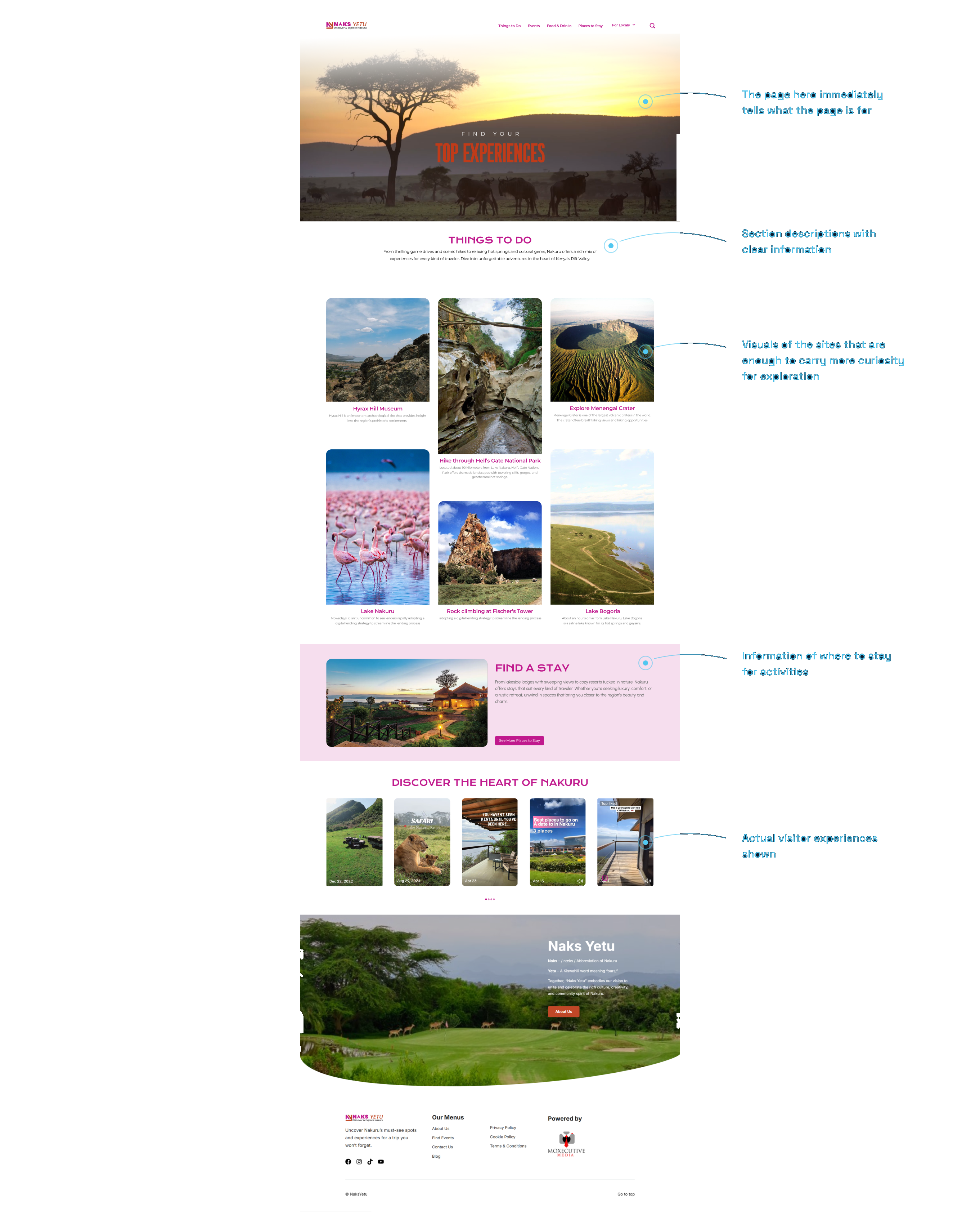
Issue: A Bucket List page that promised stays and delivered something else.
Recommendation: Rename it for what's there and make every card a real way in.
 ‹ Drag ›
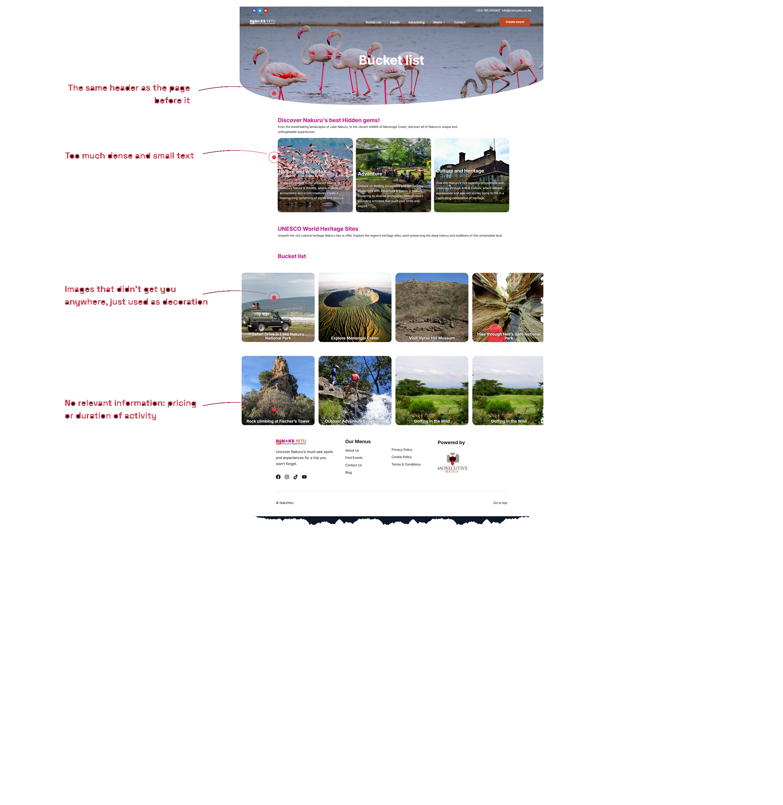
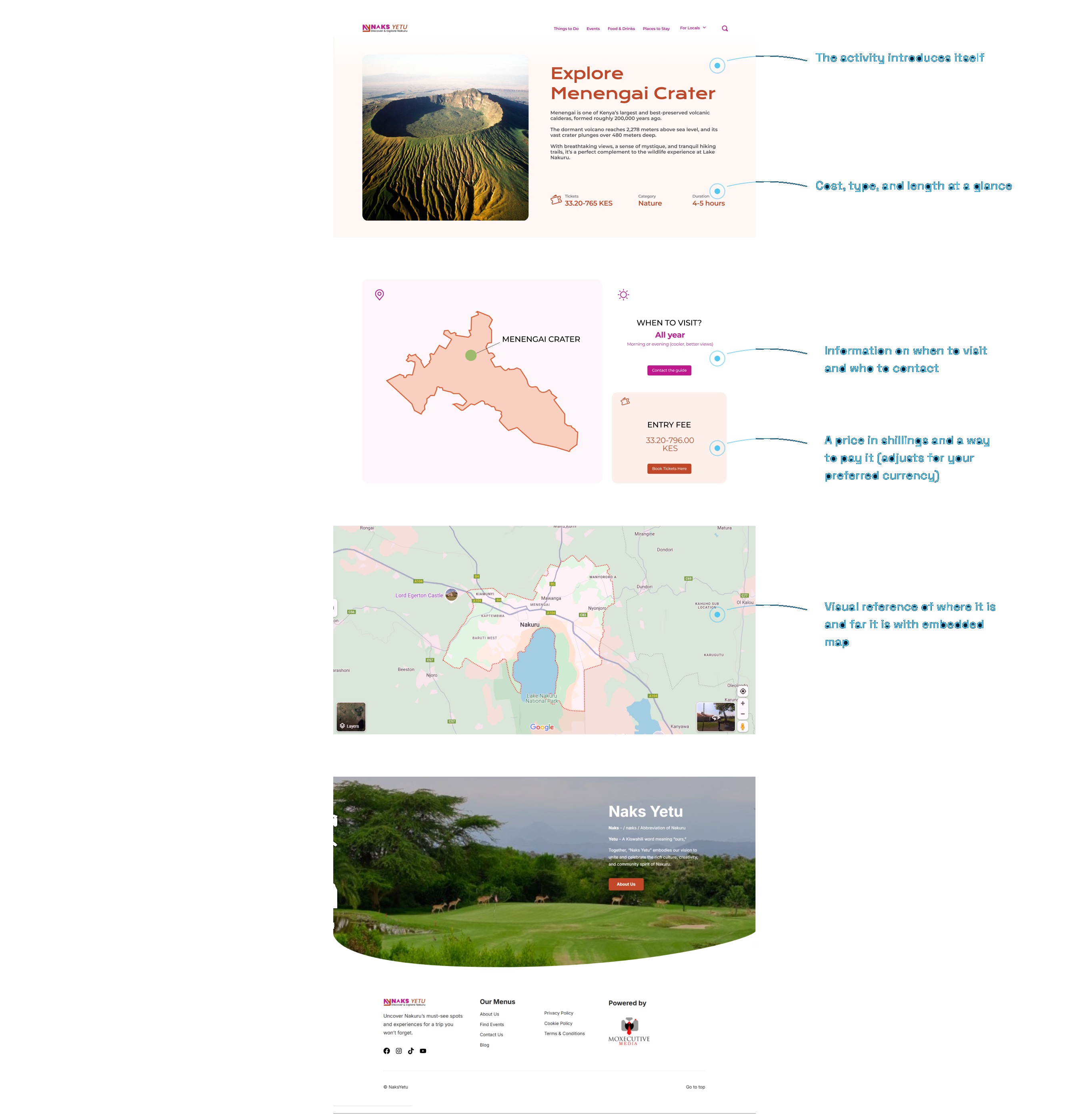
Issue: 100% asked how to book, and nothing on the page answered.
Recommendation: Cost, duration, and location up front, with a way to act on it.
 ‹ Drag ›
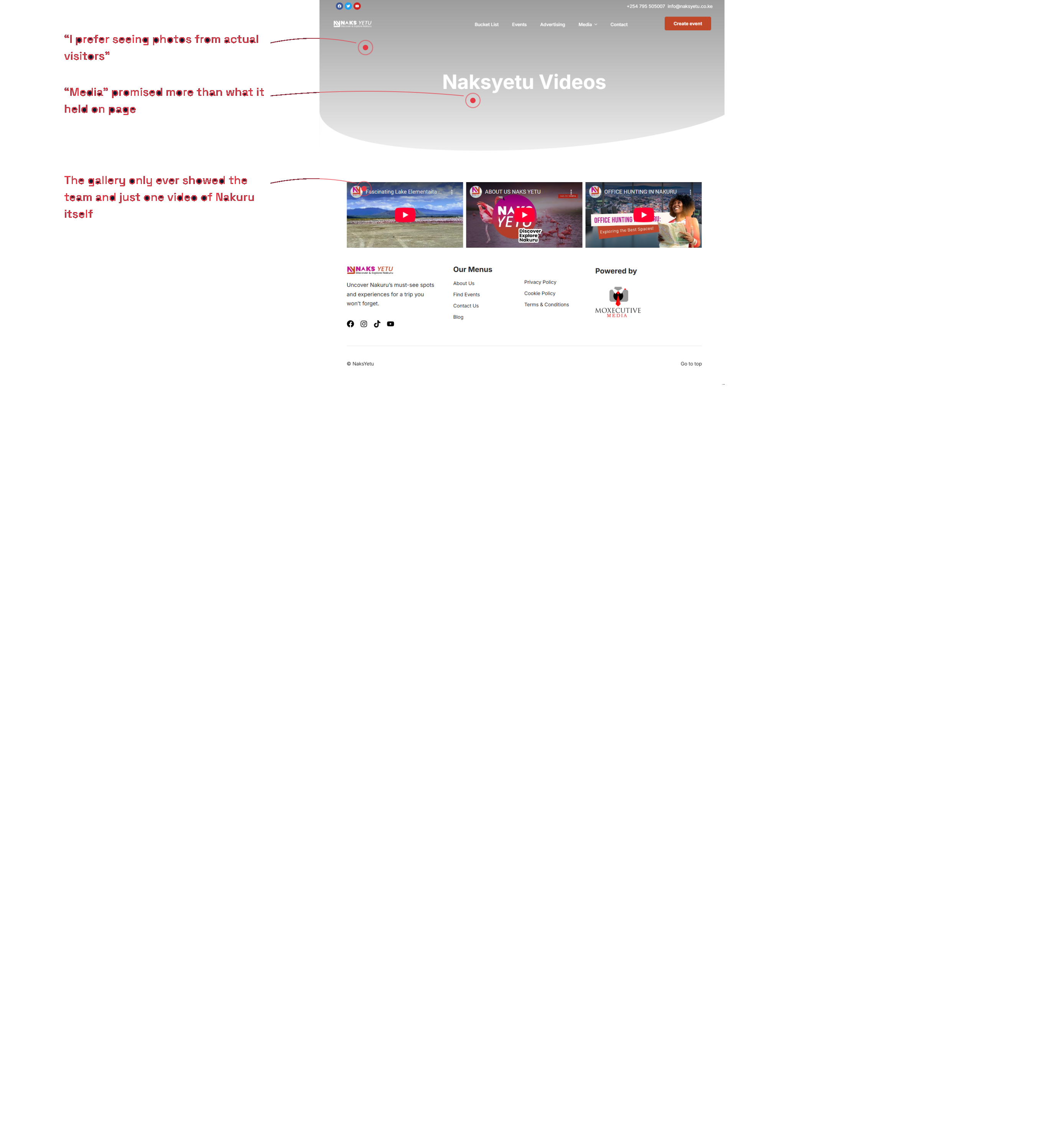
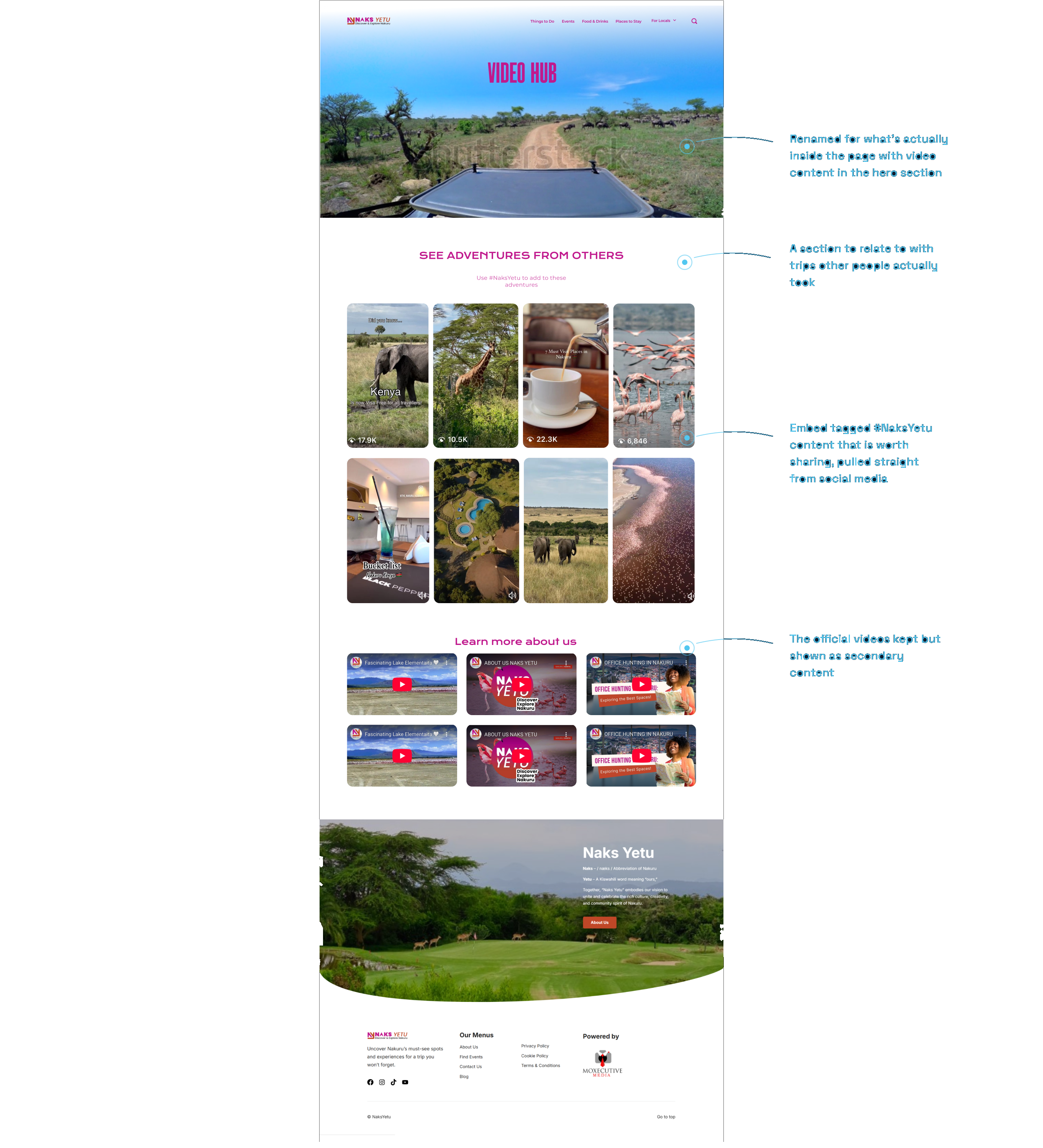
Issue: Media promised visitor content and delivered the team's own videos.
Recommendation: Lead with trips people actually took, official videos underneath.
 ‹ Drag ›
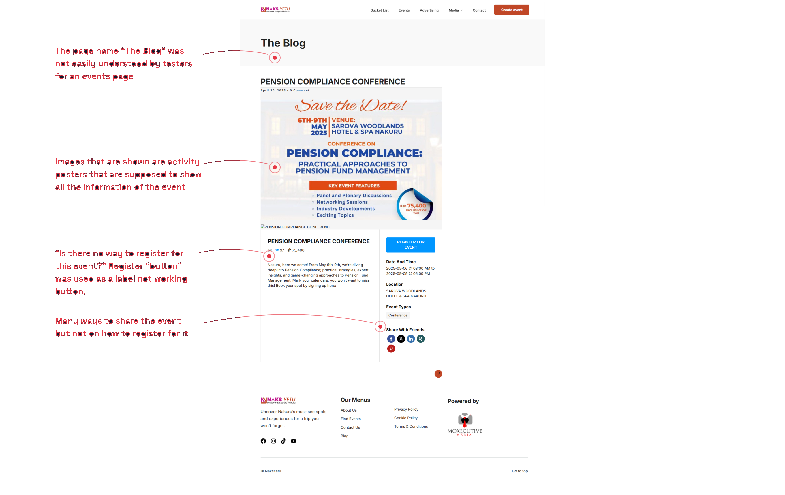
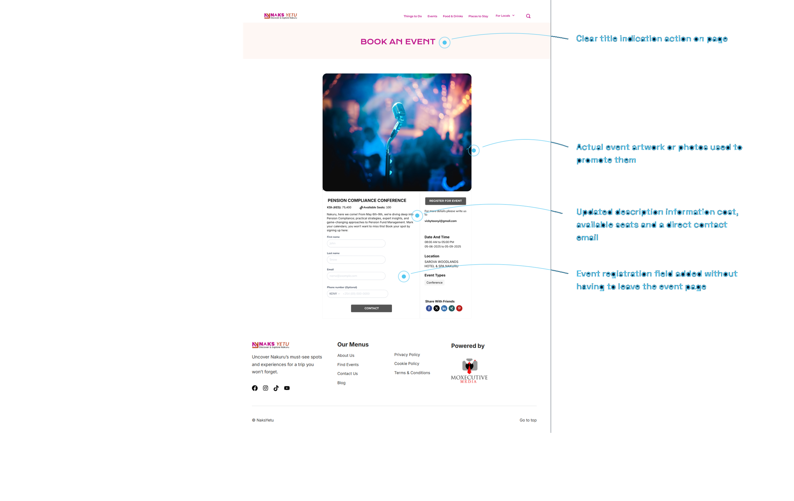
Issue: Event details locked inside a poster, registration off-site.
Recommendation: A real event page with the details pulled out and the RSVP built in.
 ‹ Drag ›
MY ROLE WITHIN THE TEAM
Hands in every stage, from the interview scripts to the screens.
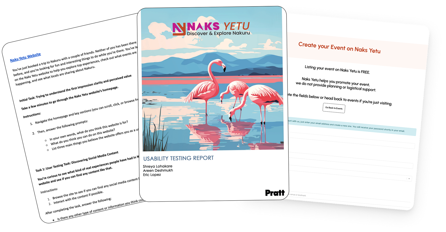
I helped draft the testing scenarios, tasks, and session scripts, ran two interviews myself, and worked the data into patterns with the team. The redesigns were shared. Mine were the Media page and the event submission flow for local organizers, with feedback across the rest.
WHAT I DIDN'T ACCOUNT FOR ¯\(ツ)/¯
The website itself barely worked, and testing it was the hard part.
The unexpected part was not the research plan, it was the site. Pages broke in ways we did not predict, so before any participant got a task we had to troubleshoot each page ourselves, making sure every step could actually be completed before someone sat down to try it.
WHAT I LEARNED FROM THIS EXPERIENCE
The next step is strategy.
The recommendations given to Naks Yetu team point to a clear place to start. What would move them furthest now is a strategy for how the platform grows: what it is for, who it serves first, and how new pages get added without pulling the site apart again.
That is the piece I would want to work on next.
¡Gracias!
Thank you for stopping by!
If you want to explore any part of this further, let me know.
IN ORBIT